Sky Printing / 2019
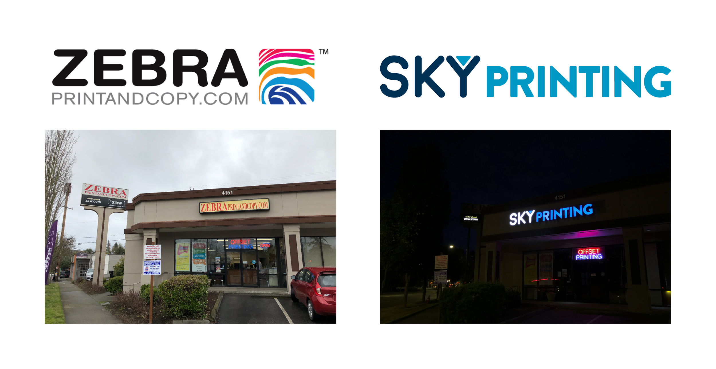
Sky Printing is the quintessential design and printing resource in West Seattle. For nearly ten years they were Zebra Print and Copy, and then in 2019 the owner decided to refresh the brand. After only a few months of working in the shop as a designer, my colleague and I were asked to begin brainstorming ideas for a new logo.
Mood Board
With nothing more than a name, we identified what defines both the sky and printing services and worked from there. Here are some inspirations I found to get started.
You can find these designs and the original creators in my Dribbble bucket.
Digital Sketches
Evolving from Basic Shapes
Simple circles and squares weren’t cutting it, so what better way to elevate this sketch than a cloud that raises the name as high as the sky. (har har).
This approach was satisfying and made the emblem styled logo more dynamic, however the cloud itself was bleak and the balance was awkward.
Punching It Up
I chose to sleep on the cloud, thankfully. I redrew it to be more cartoon-like and recognizable while remaining simple and professional. With the new shape, I shifted the type up and to the left so that there would be more diagonal balance and it would feel like both elements complete the circle, rather than having been thrown in the center.
Starting Over
After my initial presentation and a few weeks passed, the owner showed me some digital sketches from another designer and expressed interest in clean and recognizable logos such as those of car manufacturers. This made me think, “streamline and simple”.
I took it and ran.
Sketches from other designer.
New Inspiration
You can find these designs and the original creators in my Dribbble bucket.
Reconfiguring the Concept
When I think of logos for car companies, simplified emblems such as Honda’s “H” comes to mind. This influenced my approach to make “SKY” and the “Y” be elements that could easily stand on their own.
Keeping with the theme, I once again added graphic elements that referenced both the sky and printing:
The grey swoosh, playing with the idea of being “streamlined” and referencing both the wind and gloomy sky in Seattle.
As for the “Y”, I enjoyed the inverted triangle the other designer used. This simple shape tied together the three main themes for the logo. It is similar to common elements in car logos, it is reminiscent of ink level indicators for printers and print software, and it symbolizes the sky between mountains and hills.
Tighten It
Make It More Simple
Alright, time for the swoosh to go. In hindsight, I like what I ended up with in its last iteration, but for a storefront sign and branding in general the logo is better off without it. The black text and grey swoosh felt more corporate. By removing the swoosh and changing the black to a darker blue, it provides the logo with a friendlier approach that is suituble for this neighborhood print shop.
Final Adjustments
Changing “SKY” from black to dark blue was definitely the way to go, but sadly made the logo lose its punch. The contrast between the two colors were nearly abysmal, and it made the entire logo fall flat.
At this point in the process the owner loved what I was working with, and I would have to agree with the sentiment. They had concerns about the dark blue being too dark, especially as I began working on our new business cards, so I worked with them through this final adjustment.


